Dozen Photo Challenge
- Isabella Leite
- Feb 22, 2024
- 2 min read

Composition:


Lighting:


Color/B&W:


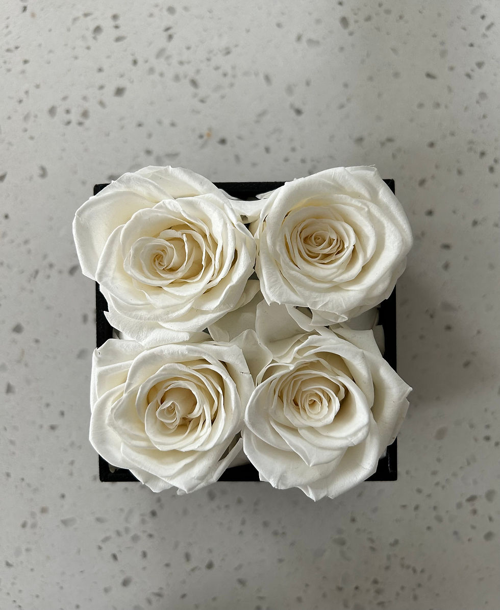
My Best Photo: The Bulls Eye

I think this is my most successful photo because the bulls eye perspective shows the detail of the subject of the photograph, in this case, the roses. The eye goes straight to the focus of the photo, and is not distracted by other background aspects.
For me, the most challenging aspect of this assignment was finding using the lighting to highlight what I wanted to photograph. I found the lighting aspect to be difficult, and I struggled with being able to use different lightings in a unique way in my pictures.
In the future to improve and create stronger photos, I will think about what it is about the subject that I want to highlight, as well as what effect I want the photograph to have on the viewer. These aspects influence what kind of lighting, composition, and coloring to use when photographing.
Part 2: Comment on Another Student's Blog
My Comment: "I really like the image posted as the best photo from this assignment. The focus of the building is highlighted by the back lighting and I think that this effect makes the structure pop. The colors in the sky are more visible due to the building covering the sun. This photograph makes me feel as though I am walking by the building, being shadowed from the bright sun. I also like the angle that the photo was taken, as you can see the cross at the top the building clearly. If I were to do something differently to make this image more visually appealing, I would try to see how a lower perspective might look, and see if this composition technique, along with the back lighting, may enhance the subject of the photo. Additionally, a larger depth of field might be adjusted alongside this, to create a more expansive photo composition."
Student's Blog Post Link: https://art180cw.weebly.com/blog/dozen-photo-challenge#comments


Comment by Sydney Herry
I really like your black and white photo. First off I love how simplistic it is and I love that rather than editing the photo to be black and white, it looks like the scene itself is actually black and white. The one thing that would've elevated this picture is if the object was larger. However, I think the angle you used was great. It's mysterious and makes the viewer wonder where the photo was taken.
Comment by Jessica Cagan Hi Bella! I really enjoy this picture because it used the bull's eye method properly and also contains aspects of symmetry that make the photo pleasing to look at. My critique would be that as discussed in the lecture, the bull's eye technique tends to make an image or scene less interesting than capturing a unique perspective. However, I think that since the subject itself contains detail and symmetry, it keep the photo interesting. I really like how the pot the roses are in is a square surrounding the 4 circular flowers. Using different shapes and the patterned background made this photo have some depth which I love!
I really liked the picture chosen as the best photo from Bella's blog. The bull's eye perspective really captures the details of the roses and the flowers. Seeing straight down into the center of the roses shows highlights the subject of the photo the best. Additionally, the simple background doesn't distract from the subject of the picture. The minimal background was a good choice for this photo to keep the audience focused on the roses.
Comment by Rory Kooker
I think that this photo is a great example of a bull's eye image. The roses are perfectly centered in the photo and the complexity and texture of them really sticks out. My eyes are immediately drawn to the subject as they should be for a bull's eye photo, and there are no distractions in the image. The symmetry of the roses also makes it a good bull's eye image because there isn't too much to look at. One thing that I think could elevate this photo is taking it with a dark background. Since the roses are white, I think the white background makes them stand out less. I think with a dark or black…